 i didnt expect the yellow to go over the black so well, its produced a really sharp quality in the letters.
 i used the frame and cut out to make it more symetrical.
 sorry if you can see this well but i didnt use any colour on this as i really loved the embossing technique and wanted to see how it looked on its own, the actuall images looks amazing, the letters have come out perfectly. I didnt realise how much of a difference using wet paper made, it helped all the colours to come out brighter and the shaped under the paper came throught stronger.
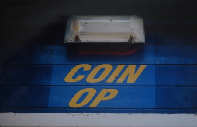
The mono print induction was one of my favourite workshops, found it easy to reel of image after image working this way. Here are some of my favourites that have worked really well with the layering colour and the embossing. The letter forms i used are used as more shapes than letters as people i asked couldn't recognise what letter forms they were, can you? :D

 theses are the A4 boards they look better than the prints!
No comments:
Post a Comment