Tuesday, 15 September 2009

Blush Publishing


I bought this card in Bluebell Book shop in Penrith, my FAVIOURITE shop ever for stationary and books and cards. so i picked up this card and what was nice about it was the feel of it it, it has a very handmade quality not in a non-professional way but feels like its just been printed. They are also embossed with the lettering both on the design and the details on the back cover. anyway i though they were incredibly simple but just lovely so i got one and found all these others on their site! Blush Publishing


Saturday, 1 August 2009

Windermeres old signs


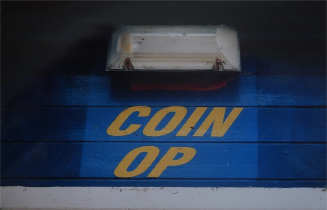
So my day in Windermere turned out to be a bigger sucsess than i thought! i went for the day to get some photographs of the old rowing boats and piers, and i found myself in a new bistro renevation with a guy who had bough old vitage signs and objects from auction for years.
these are just what i have been looking for so here are some of the best.


Tuesday, 28 July 2009

As i am now . . .

so after reviewing my rather sparse sketchbooks and many loose cut outs and photos and sketches i think i need to recap on what my project is actually looking at.
i think the main thing here is, Age! a lot of what i have been looking at deals with age in one way or another. Whether its about traditions and old fashioned culture, or an ageing artifact and derelict, abandoned looking sculptures, or elements from a very young age, the way children play and what they notice around them and i suppose how innocent things are at a young age!

OK so i hope that makes sense and i will keep up to date with this theme and hopefully i wont change it again!

Monday, 27 July 2009

film photographs (pictures of)


OK so iv finally got my photos back from developing and most of them are not bad at all! i used my film camera because it was a perfect opportunity to get back into actually taking a photograph. having to frame it having to set up your camera and take the shot exactly how u want it, instead of pointing and clicking, not using the view finder, and using auto settings and getting thousands of photos and knowing you will probably get a few good ones.
so here are a few of the best at the moment but the quality is not as good as they are only photographs taken of them as i don't have my scanner with me. Sorry!


Wednesday, 22 July 2009

Eleanor Wood - College


i found these images on the Brighton University blog and again they are beautiful, the first thing i noticed was the different textures and patterns used for the college which is also kept very matt. most of these give the idea of dreams ans so i like that the images of the people are kept grey scale.
it did first remind me of Chloe's kind of work but these particular ones have influenced me further for the summer project as i'm struggling with any illustration.

Sunday, 19 July 2009

nearly 2 months in and . . .

Right most of the photographs iv been taking are on my film camera so im waiting for them to be developed but in the mean time these are a few images iv been looking at to help with this project, im still on this idea of used, derelict feel and childish fun and bright colours! still dosnt make sence much but i will figure it out!


how cool is this! firstly l love collage witch makes this seem more cheerful with the different yellows and oranges, and i love the cut out lettering aswell, i think this really makes u want to smile a bit! and thats always good.

This was a bit of everything for me really, i first saw the frames or at least the top right one which has a very traditional look to it and they all look quite dull and used, as do the pictures inside them. but the images look hand drawn and quite random so this idea of kids drawings aswell.


BEAUTIFUL, i love this sort of thing, this is the sort of images iv been trying to capture with my camera.


Tuesday, 7 July 2009

Sheffield Hallam Jewellery - Emily Pilsworth


We went to the Sheffield Hallam Exhibition to see Emily Pilsworths work, who is a good friend! she has just finished on a Jewellery Design Degree and here is her work!


a ring of 6 six rings stuffed with bread


each bead can be torn off and eaten, and when they are all gone, all the silver drops to the bottom and leaves a beautiful necklace.

The concept of her work i think was dealing with permanent and disposable materials, how jewellery is seen as very valuable and mixing this with a material that is very temporary e.g. dough. some of the inspiration came from candy necklaces where children eat all the beads and left with a piece of elastic, well here she has made rings and necklaces and decorated them with silver and dough. The idea is a tear and shear one, where a group of 6 can wear these pieces and eat the bread that they hold and still be left with a piece of contemporary jewellery.